How to Develop Visual Identity for Businesses: A Strategic Guide
Read Time:12 Minute, 37 Second
Imagine walking into a store blindfolded. You can’t see the colors, the logos, or the packaging—just products on shelves. Without visual cues, even the most loyal customers would struggle to identify their favorite brands. This scenario isn’t hypothetical. In the digital age, where consumers scroll through endless options in seconds, your brand visual identity is the difference between standing out and fading into obscurity.
A staggering 75% of consumers judge a company’s credibility based on its website design, according to a 2025 Stanford University study. Yet, many businesses treat visual identity as an afterthought—a logo slapped together, a color palette chosen on a whim. The result? Weak brand recognition, diluted messaging, and lost revenue.
Developing a compelling brand visual identity isn’t about aesthetics alone. It’s a strategic process that shapes perception, builds trust, and drives engagement. From the psychology of colors to the subtleties of typography, every element communicates your brand’s values and mission. In this guide, we’ll break down the science and art of crafting a visual identity that resonates. You’ll learn from real-world examples, expert insights, and actionable steps to create a cohesive, memorable brand.
The Power of Brand Visual Identity: More Than Just a Pretty Logo
A strong brand visual identity is a silent salesperson. It works 24/7, conveying your brand’s personality without saying a word. Here’s why it’s non-negotiable for modern businesses:
1. First Impressions Are Instant—and Lasting
Humans form opinions in 50 milliseconds, according to research from the Missouri University of Science and Technology. In that blink of an eye, your logo, color scheme, and design either captivate or repel potential customers. A polished, professional visual identity signals credibility and quality.
Consider Airbnb’s 2014 rebrand. The company replaced its generic logo with the “Bélo,” a symbol representing belonging. This visual shift wasn’t just cosmetic—it reinforced Airbnb’s mission and helped the brand expand into experiences and luxury stays.
2. Consistency Builds Trust and Recognition
Consistency is the cornerstone of trust. When your visual elements—logo, colors, fonts—appear uniformly across platforms, customers recognize and remember you. A 2024 Lucidpress study found that consistent branding increases revenue by up to 33%.
Coca-Cola’s red and white color scheme is a masterclass in consistency. Whether on a billboard, a can, or a social media post, the brand is instantly recognizable. This familiarity breeds trust, making customers more likely to choose Coca-Cola over competitors.
3. Visual Identity Communicates Your Brand’s Personality
Colors, shapes, and fonts evoke emotions and associations. For example:
- Blue conveys trust and professionalism (think Facebook, IBM).
- Red signals energy and urgency (Netflix, Coca-Cola).
- Serif fonts suggest tradition and reliability (The New York Times).
- Sans-serif fonts feel modern and approachable (Google, Spotify).
Apple’s minimalist design—clean lines, ample white space, and a sleek logo—reflects its commitment to simplicity and innovation. This visual identity aligns perfectly with its brand promise: cutting-edge technology that’s intuitive to use.
4. A Strong Visual Identity Differentiates You in Crowded Markets
In saturated industries, visual identity is a competitive edge. Take the craft beer market: with thousands of breweries, packaging design often sways purchasing decisions. Brands like BrewDog use bold, rebellious visuals to stand out and attract a younger, edgier audience.
5. Visual Identity Supports Brand Loyalty
When customers connect with your visual identity, they’re more likely to become repeat buyers. A 2023 Nielsen report revealed that 64% of consumers cite shared values as the primary reason for brand loyalty. Your visual identity communicates those values visually, reinforcing emotional connections.
Patagonia’s earthy tones and rugged imagery align with its environmental mission. This visual consistency attracts like-minded customers who stay loyal because they believe in what the brand stands for.
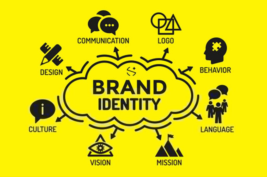
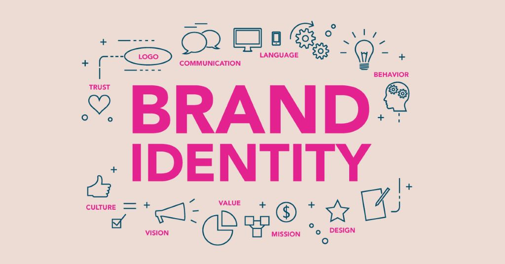
The Core Elements of a Brand Visual Identity
A cohesive brand visual identity comprises several key elements. Each must align with your brand’s personality, values, and goals. Here’s a breakdown of what to include:
1. Logo: The Face of Your Brand
Your logo is the most recognizable element of your visual identity. It should be:
- Simple: Avoid clutter. Think Nike’s swoosh or McDonald’s golden arches.
- Memorable: Unique enough to stick in customers’ minds.
- Versatile: Work across sizes and mediums, from business cards to billboards.
- Timeless: Avoid trends that will date quickly.
Pro Tip: Start with a black-and-white version to ensure your logo works without color. Then, experiment with color variations.
2. Color Palette: The Emotional Trigger
Colors influence perception and behavior. Choose a palette that reflects your brand’s personality and resonates with your audience. Limit your primary palette to 3-5 colors to maintain consistency.
Example: Slack’s vibrant color palette—purple, yellow, green, and red—conveys energy and collaboration, aligning with its mission to simplify team communication.
3. Typography: The Voice of Your Brand
Fonts set the tone for your brand’s communication. Consider:
- Serif fonts: Traditional, authoritative (e.g., Times New Roman).
- Sans-serif fonts: Modern, clean (e.g., Helvetica, Futura).
- Display fonts: Unique, attention-grabbing (use sparingly for headlines).
Pro Tip: Pair a distinctive headline font with a simple body font for readability. For example, Netflix uses a custom sans-serif font for its logo and a clean, legible font for its interface.
4. Imagery and Photography Style
Images should reflect your brand’s aesthetic and values. Define guidelines for:
- Style: Lifestyle, product-focused, or abstract.
- Filters and Editing: Consistent color grading and composition.
- Subject Matter: What kinds of scenes or people align with your brand?
Example: Glossier’s soft, pastel-heavy photography reinforces its minimalist, “skin-first” beauty philosophy.
5. Graphic Elements and Icons
Icons, patterns, and illustrations add depth to your visual identity. They should complement your logo and color palette while enhancing brand recognition.
Example: Mailchimp’s playful, hand-drawn illustrations make its emails and marketing materials instantly recognizable.
6. Brand Guidelines: The Rulebook for Consistency
Document your visual identity in a brand style guide. This should include:
- Logo usage (sizing, spacing, variations).
- Color codes (HEX, RGB, CMYK).
- Typography rules (fonts, sizes, hierarchy).
- Imagery and graphic standards.
- Examples of correct and incorrect usage.
Pro Tip: Share your brand guidelines with everyone who creates content for your business—designers, marketers, and external partners.
Step-by-Step: How to Develop a Visual Identity for Your Business
Creating a brand visual identity is a structured process. Follow these steps to ensure your identity is strategic, cohesive, and effective:
Step 1: Define Your Brand’s Core Identity
Before designing, clarify your brand’s foundation:
- Mission: Why does your business exist?
- Values: What principles guide your decisions?
- Personality: If your brand were a person, what traits would it have?
- Target Audience: Who are you trying to reach?
Example: Tesla’s mission to accelerate sustainable energy shapes its sleek, futuristic visual identity. Its minimalist logo and clean design reflect innovation and environmental consciousness.
Step 2: Research Your Industry and Competitors
Analyze your competitors’ visual identities. Identify gaps and opportunities to differentiate. Ask:
- What colors, fonts, and styles dominate your industry?
- How can you stand out while still appealing to your audience?
Pro Tip: Use tools like Coolors or Adobe Color to explore color trends in your industry.
Step 3: Brainstorm and Sketch Ideas
Start with rough sketches and mood boards. Experiment with:
- Logo concepts.
- Color combinations.
- Font pairings.
- Image styles.
Pro Tip: Use platforms like Pinterest or Milanote to organize inspiration.
Step 4: Design Your Logo
Work with a designer or use tools like Canva, Adobe Illustrator, or Looka to create your logo. Ensure it:
- Represents your brand’s personality.
- Works in black and white.
- Scales to different sizes.
Example: The FedEx logo hides an arrow between the “E” and “x,” subtly conveying speed and precision—a perfect fit for a logistics company.
Step 5: Choose Your Color Palette
Select colors that align with your brand’s emotions and values. Use color psychology as a guide:
- Red: Energy, passion (Coca-Cola, Netflix).
- Blue: Trust, professionalism (Facebook, IBM).
- Green: Growth, health (Whole Foods, Starbucks).
- Yellow: Optimism, warmth (McDonald’s, Snapchat).
Pro Tip: Test your colors for accessibility. Ensure they’re distinguishable for color-blind users using tools like WebAIM’s Contrast Checker.
Step 6: Select Your Typography
Choose fonts that reflect your brand’s tone. Stick to 2-3 fonts for consistency:
- Headline Font: Bold and distinctive.
- Body Font: Clean and readable.
Example: Google’s use of Product Sans reinforces its modern, user-friendly identity.
Step 7: Develop Imagery and Graphic Guidelines
Define the style of images and graphics you’ll use. Consider:
- Photography: Lifestyle, product-focused, or abstract.
- Illustrations: Custom drawings or icons.
- Filters: Consistent editing for a cohesive look.
Pro Tip: Create a library of on-brand images and graphics for easy access.
Step 8: Document Your Brand Guidelines
Compile your visual identity into a brand style guide. Include:
- Logo variations and usage rules.
- Color codes and palettes.
- Typography hierarchy.
- Image and graphic standards.
- Examples of correct and incorrect usage.
Pro Tip: Use templates from Canva or Adobe to create a professional brand guide.
Step 9: Implement and Monitor
Roll out your visual identity across all platforms—website, social media, packaging, and marketing materials. Monitor its performance:
- Brand Recognition: Are customers identifying your brand more easily?
- Engagement: Are visuals increasing interaction on social media?
- Feedback: What are customers saying about your new look?
Pro Tip: Use A/B testing to compare different visual elements and refine your identity based on data.
Common Mistakes to Avoid When Developing Your Visual Identity
Even well-intentioned businesses make errors that weaken their brand visual identity. Here’s what to watch out for:
1. Following Trends Blindly
Trends fade. A visual identity should be timeless. Avoid overly trendy fonts, colors, or design elements that will look dated in a year.
Example: In the early 2010s, many brands adopted flat design. While it’s still popular, those that overused it now look generic.
2. Overcomplicating the Logo
A complex logo is hard to reproduce and recognize. Aim for simplicity and scalability.
Example: Starbucks’ original logo was highly detailed. The company simplified it over time to improve versatility.
3. Ignoring Accessibility
Your visual identity should be inclusive. Ensure colors have sufficient contrast, fonts are readable, and designs are navigable for all users.
Pro Tip: Use tools like aXe or WAVE to audit your designs for accessibility.
4. Inconsistent Application
Inconsistency dilutes brand recognition. Apply your visual identity uniformly across all touchpoints—digital and physical.
Example: A brand that uses one logo on its website and another on social media confuses customers and weakens trust.
5. Neglecting the Emotional Connection
Visual identity isn’t just about looking good—it’s about feeling right. Ensure your design evokes the emotions you want associated with your brand.
Example: Disney’s whimsical fonts and bright colors create a sense of magic and nostalgia, aligning with its family-friendly brand.
Expert Tips for a Standout Brand Visual Identity
1. Start with Black and White
Design your logo and key elements in black and white first. This ensures they work without relying on color.
2. Test Across Mediums
Your visual identity should look great on a business card, a billboard, and a mobile screen. Test scalability early.
3. Involve Your Team
Your employees are brand ambassadors. Include them in the process to ensure buy-in and consistent application.
4. Tell a Story with Your Visuals
Every element should tie back to your brand’s narrative. For example, TOMS Shoes’ visual identity reflects its “One for One” giving model through simple, heartfelt imagery.
5. Plan for Evolution
Your visual identity should grow with your brand. Build flexibility into your guidelines for future updates.
Expert Insight: “A great visual identity isn’t just seen—it’s felt. It should resonate emotionally and intellectually with your audience.” — Debbie Millman, Branding Expert and Host of Design Matters
Reviews: What Business Leaders Say About Brand Visual Identity
Richard Branson, Founder of Virgin Group
“Your brand is your story. The visual identity is how you tell that story at a glance. Invest in it wisely—it’s the first impression you’ll never get to redo.”
Howard Schultz, Former CEO of Starbucks
“Starbucks’ green apron and siren logo aren’t just designs—they’re symbols of our commitment to community and quality. That’s the power of visual identity.”
Seth Godin, Marketing Guru and Author
“People don’t buy products; they buy stories and emotions. Your visual identity is the shortcut to those emotions.”
Related Topics:
-
How to Build Creative Branding Strategies: A Game-Changing Guide for 2026
-
How to Create Stunning Designs for Your Business: The 2026 Playbook for Memorable Branding
FAQs About Developing a Brand Visual Identity
1. How much does it cost to develop a brand visual identity?
Costs vary widely. DIY tools like Canva or Looka start at $50–$200. Hiring a freelance designer ranges from $500–$5,000, while a full-service agency can cost $10,000–$50,000+.
2. Can I create my own visual identity without a designer?
Yes, but proceed with caution. Tools like Canva, Adobe Express, and Looka offer templates, but a professional designer ensures your identity is unique, scalable, and strategically aligned with your brand.
3. How often should I update my brand visual identity?
Update when your brand evolves—new products, audiences, or values. Most brands refresh every 5–10 years, but minor tweaks (e.g., color adjustments) can happen more frequently.
4. What’s the difference between a logo and a brand visual identity?
A logo is one element of your visual identity. The identity includes colors, fonts, imagery, and guidelines that create a cohesive brand experience.
5. How do I ensure my visual identity works globally?
Research cultural associations with colors, symbols, and imagery. For example, white represents purity in Western cultures but mourning in some Eastern cultures.
6. Should my visual identity be the same across all platforms?
Yes, but adapt as needed. Your logo might simplify for social media avatars, but colors, fonts, and imagery should remain consistent.
7. How can I measure the success of my visual identity?
Track metrics like brand recognition, customer engagement, and sales. Conduct surveys to gauge how customers perceive your brand.
Conclusion: Your Visual Identity Is Your Silent Ambassador
In a world where attention spans are shrinking and competition is fierce, your brand visual identity is your most powerful tool. It communicates who you are, what you stand for, and why customers should choose you—all without a single word.
From the psychology of colors to the art of typography, every detail matters. A well-crafted visual identity builds trust, fosters loyalty, and sets you apart. It’s not just about looking good; it’s about creating a lasting impression that drives business growth.
Ready to transform your brand? Start by defining your core identity, then build a visual language that speaks to your audience. Whether you’re launching a startup or refreshing an established brand, the principles in this guide will set you on the path to success.
Featured Image Source
Average Rating